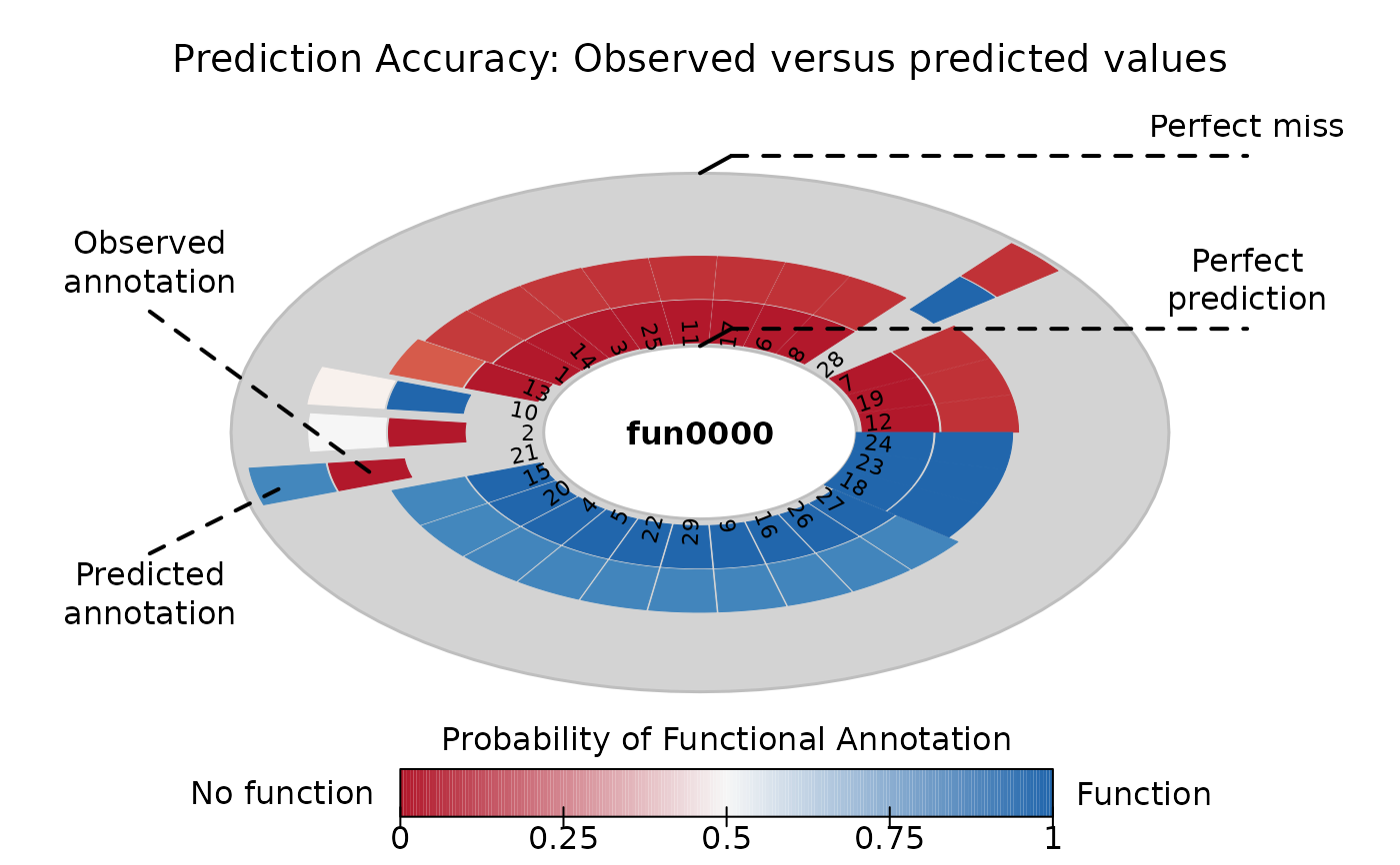
Visualize predictions
Arguments
- x
An object of class
aphylo_prediction_score.- y
Ignored.
- main
Passed to
title.- main.colorkey
Character scalar. Title of the colorkey (optional).
- which.fun
Integer vector. Which function to plot.
- include.labels
Logical scalar. When
TRUE, draws nice labels at each slice which by default are specified as the rownames ofx$expected. This is mostly useful when the number of predictions is small.- labels.col
Character scalar. Color of the labels.
- leafs_only
Logical. When
TRUE(default) only plots the leaf nodes.- ...
Ignored
Value
NULL (invisible) Generates a plot of the predictions.
Details
If include.labels = NULL and ncol(x$expected) > 40,
then include.labels=FALSE by default.
Examples
set.seed(8783)
atree  <- raphylo(29)
ans    <- aphylo_mle(atree ~ mu_d + mu_s + Pi)
pred_s <- prediction_score(ans)

pred_s
#> Prediction score (H0: Observed = Random)
#>
#>  N obs.      : 57
#>  alpha(0, 1) : 0.48, 0.52
#>  Observed    : 0.85 ***
#>  Random      : 0.50
#>  P(<t)       : 0.0003
#> --------------------------------------------------------------------------------
#> Values scaled to range between 0 and 1, 1 being best.
#>
#> Significance levels: *** p < .01, ** p < .05, * p < .10
#> AUC 0.94.
#> MAE 0.15.
plot(pred_s)