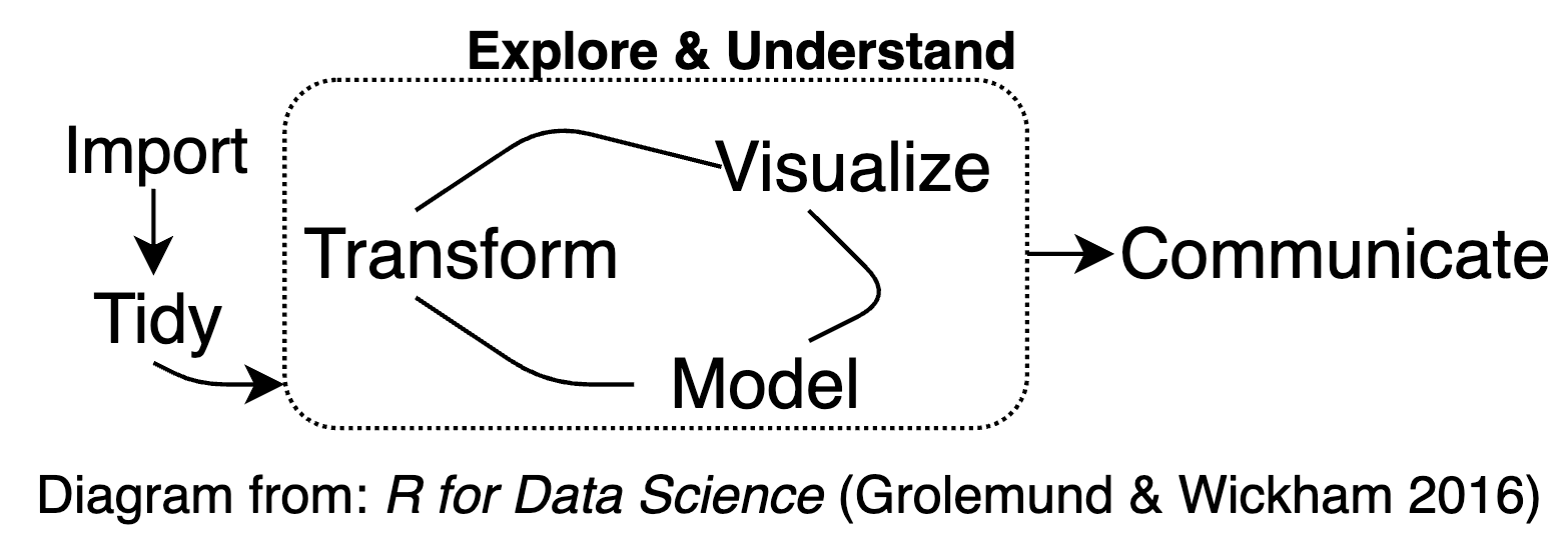
Interactive Visualization
PM 566: Introduction to Health Data Science
Acknowledgment
These slides were originally developed by Abigail Horn.
Introduction
What is interactive visualization?
Interactive visualization involves the creation and sharing of graphical representations of data, model, or results that allow a user to directly manipulate and explore.
Some example products and packages in R:
- Interactive plots (
Plotly) - Interactive maps (
plotly,Leaflet) - Interactive tables (
DT) - Dashboards (
flexdashboard) - Interactive applications (
shiny) - Websites (Static using
Quarto,R Markdown,blogdown,Hugo,Jeckyll)
What is interactive visualization (cont.)
Interactivity allows users to engage with data / models in a way that static visuals cannot
Features of interactivity include:
- Identify, isolate, and visualize information for extended periods of time
- Zoom in and out
- Highlight relevant information
- Get more information
- Filter
- Animate
- Change parameters
Why use interactive visualization?
Interactive visualization helps with both the exploration and communication parts of the data science process
Interactive Visualization for exploratory data analysis (EDA)
Interactive graphics are well suited to aid the exploration of high-dimensional or otherwise complex data. Interacting with information in a visual way helps to enable insights that wouldn’t be easy or even possible with static graphics, for reasons including:
Investigate faster: In a true exploratory setting, you have to make lots of visualizations, and investigate lots of follow-up questions, before stumbling across something truly valuable. Interactive visualization can aid in the sense-making process by searching for information quickly without fully specified questions (Unwin and Hofmann 1999)
Identifying relationships or structure that would otherwise go missing (J. W. Tukey and Fisherkeller 1973)
Understand or diagnose problems with data, models, or algorithms (Wickham, Cook, and Hofmann 2015)
Interactive visualization for communication
Interactive graphics are well suited to communicating high-dimensional or otherwise complex data. Interacting with information in a visual way may help communicating data, models, and results for reasons including:
- Engagement with information has been shown to improve the ability to retain information
Interactive visualization for communication (cont. 1)

Interactive visualization for communication (cont. 2)
Automate and efficiently share multiple dimensions of data/models/findings or complex analysis tasks
Help users to better understand, and make decisions on, data/models/findings
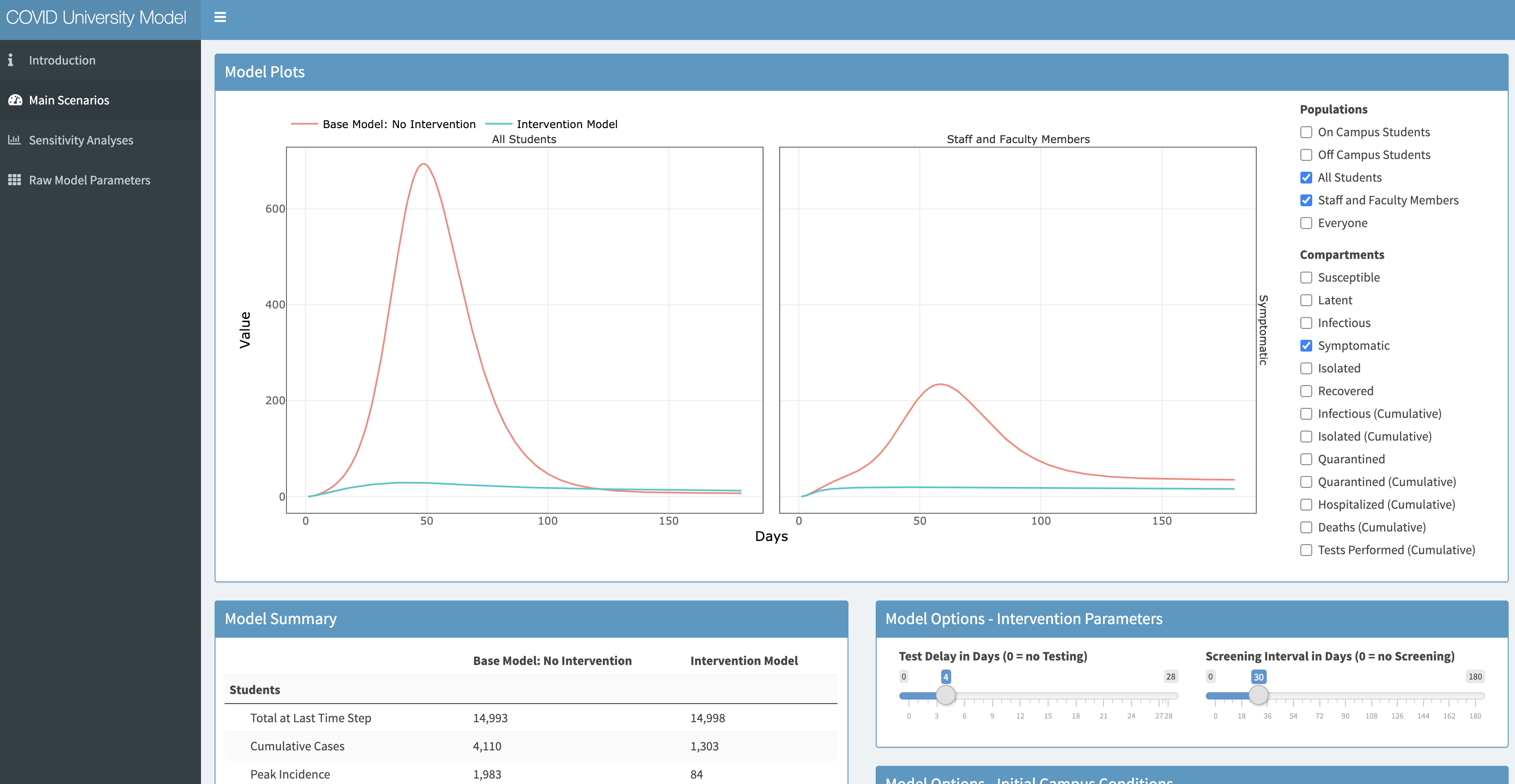
EpiModel Shiny app for COVID testing at universities
Interactive visualization for communication (cont. 3)
Tell a more interesting or engaging story, presenting multiple viewpoints of data
Allow users to focus on the aspects most important to them, making the user more likely to understand, learn from, remember and appreciate the data
Two Classes on Interactive Visualization in Data Science
Today:
- Creating interactive graphs with the plotly package and tables with DT
Next week:
- Creating a website using RStudio and GitHub Pages
- Sharing your interactive graphics
- Survey other options for sharing interactive graphics (Shiny apps, dashboards)
Plotly
What is Plotly?

Plotly is an open source library for creating and sharing interactive graphics
It is powered by the JavaScript graphing library plotly.js and is designed on principles of adding layers
Plotly can work with several programming languages and applications including R, JavaScript, Python, Matlab, and Excel.
Plotly for R graphics are based on the
htmlwidgetsframework, which allows them to work seamlessly inside of larger rmarkdown documents, inside shiny apps, RStudio, Jupyter notebooks, the R prompt, and more.
plot_ly() vs. ggplotly()
There are two main ways to create a plotly object:
Transforming a
ggplot2object (viaggplotly()) into a plotly objectDirectly initializing a plotly object with
plot_ly()/plot_geo()/plot_mapbox(). This provides a ‘direct’ interface to plotly.js with some additional abstractions to help reduce typing
Both approaches are powered by plotly.js so many of the same concepts and tools that you learn for one interface can be reused in the other
plot_ly() function
The plot_ly() function has numerous arguments that are unique to the R package (e.g., color, stroke, span, symbol, linetype, etc.) and make it easier to encode data variables as visual properties (e.g., color). By default, these arguments map values of a data variable to a visual range defined by the plural form of the argument
(almost) every function anticipates a plotly object as input to its first argument and returns a modified version of that plotly object
The
layout()function, which modifies layout components of the plotly object, anticipates a plotly object in its first argument and its other arguments add and/or modify various layout components of that object (e.g., the title)
plot_ly() function (cont.)
A family of
add_*()functions (e.g.,add_histogram(),add_lines(),add_trace(), etc.) define how to render data into geometric objects by adding a graphical layer to a plot. Layers can be included to add:- data
- aesthetic mappings (e.g., assigning
claritytocolor) - geometric representation (e.g., rectangles, circles, etc.)
- statistical transformations (e.g., sum, mean, etc.)
- positional adjustments (e.g., dodge, stack, etc.)
ggplotly()
We also have the option of working with the
ggplotly()function from the plotly package, which can translate ggplot2 to plotly.The essence of this is very straightforward:
- This functionality can be really helpful for quickly adding interactivity to your existing ggplot2 workflow.
ggplotly() (cont.)
ggplotly()provides advantages toplot_ly()in particular when it comes to exploring statistical summaries across groups. The ability to quickly generate statistical summaries across groups and map to an interactive plot works for basically any geom (e.g.,geom_boxplot(),geom_histogram(),geom_density(), etc.)
Getting started
Install Plotly
Load data for examples
For examples today we will be using COVID data direct downloaded from the New York Times GitHub repository: https://raw.githubusercontent.com/nytimes/covid-19-data/master/us-states.csv
- This data source provides COVID cases (confirmed infections) and deaths for each US state by date
Load data for examples (cont. 1)
We have pre-processed this data and added some additional variables in the file "data/coronavirus_states.csv"
populationof each statenew_cases: daily change in casesnew_deaths: daily change in deathsper100k: cases per 100,000 populationdeathsper100k: deaths per 100,000 populationnaive_CFR: naive1 Case Fatality Rate (CFR) = deaths / cases, for each state on each date
In the lab we will preprocess this data together.
Load data for examples (cont. 2)
Load data for examples (cont. 3)
Inspect the data
'data.frame':   13104 obs. of  15 variables:
 $ state             : chr  "Alabama" "Alabama" "Alabama" "Alabama" ...
 $ date              : Date, format: "2020-03-13" "2020-03-14" ...
 $ fips              : int  1 1 1 1 1 1 1 1 1 1 ...
 $ cases             : int  6 12 23 29 39 51 78 106 131 157 ...
 $ deaths            : int  0 0 0 0 0 0 0 0 0 0 ...
 $ population        : int  4779736 4779736 4779736 4779736 4779736 4779736 4779736 4779736 4779736 4779736 ...
 $ new_cases         : int  6 6 11 6 10 12 27 28 25 26 ...
 $ new_deaths        : int  0 0 0 0 0 0 0 0 0 0 ...
 $ days_since_death10: int  0 0 0 0 0 0 0 0 0 0 ...
 $ days_since_case100: int  0 0 0 0 0 0 0 0 1 2 ...
 $ per100k           : num  0.1 0.3 0.5 0.6 0.8 1.1 1.6 2.2 2.7 3.3 ...
 $ newper100k        : num  0.1 0.1 0.2 0.1 0.2 0.3 0.6 0.6 0.5 0.5 ...
 $ deathsper100k     : num  0 0 0 0 0 0 0 0 0 0 ...
 $ newdeathsper100k  : num  0 0 0 0 0 0 0 0 0 0 ...
 $ naive_CFR         : num  0 0 0 0 0 0 0 0 0 0 ...
Load data for examples (cont. 4)
Inspect the data
    state                date                 fips           cases
 Length:13104       Min.   :2020-01-21   Min.   : 1.00   Min.   :     1
 Class :character   1st Qu.:2020-05-01   1st Qu.:17.00   1st Qu.:  2089
 Mode  :character   Median :2020-06-29   Median :31.00   Median : 16764
                    Mean   :2020-06-28   Mean   :31.87   Mean   : 62365
                    3rd Qu.:2020-08-28   3rd Qu.:46.00   3rd Qu.: 70786
                    Max.   :2020-10-26   Max.   :78.00   Max.   :916562
     deaths           population         new_cases         new_deaths
 Min.   :    0.00   Min.   :   56882   Min.   :    0.0   Min.   :   0.00
 1st Qu.:   51.75   1st Qu.: 1360301   1st Qu.:   45.0   1st Qu.:   0.00
 Median :  453.50   Median : 3831074   Median :  264.0   Median :   4.00
 Mean   : 2158.38   Mean   : 5882962   Mean   :  670.6   Mean   :  17.26
 3rd Qu.: 2057.00   3rd Qu.: 6547629   3rd Qu.:  770.0   3rd Qu.:  15.00
 Max.   :33073.00   Max.   :37253956   Max.   :22276.0   Max.   :1877.00
 days_since_death10 days_since_case100    per100k         newper100k
 Min.   :  0.00     Min.   :  0.00     Min.   :   0.0   Min.   :  0.00
 1st Qu.: 22.00     1st Qu.: 36.00     1st Qu.: 125.2   1st Qu.:  2.50
 Median : 83.00     Median : 96.00     Median : 623.4   Median :  7.10
 Mean   : 87.37     Mean   : 98.12     Mean   : 954.1   Mean   : 11.28
 3rd Qu.:146.00     3rd Qu.:158.00     3rd Qu.:1563.9   3rd Qu.: 15.30
 Max.   :237.00     Max.   :233.00     Max.   :5686.4   Max.   :220.40
 deathsper100k    newdeathsper100k    naive_CFR
 Min.   :  0.00   Min.   : 0.0000   Min.   : 0.000
 1st Qu.:  3.60   1st Qu.: 0.0000   1st Qu.: 1.440
 Median : 14.90   Median : 0.1000   Median : 2.550
 Mean   : 29.39   Mean   : 0.2464   Mean   : 3.079
 3rd Qu.: 40.00   3rd Qu.: 0.3000   3rd Qu.: 4.330
 Max.   :185.30   Max.   :21.3000   Max.   :31.250
Examples
Basic Scatterplot
Let’s start with a scatterplot of population-normalized (per100k) deaths vs. cases on the most recent date from dataframe cv_states_today
- Specify a scatterplot by
type = "scatter"andmode = 'markers' - Notice how the arguments for the
xandyvariables as specified as formulas, with the tilde operator (~) - Use
colorto specify an additional data dimension (factor or continuous), and map each level of the dimension to a different color (factor or continuous) colorsis used to specify the range of colors
Basic Scatterplot (cont. 1)
- Scatterplot of deaths vs. cases population-normalized (
per100k) - plotly allows us to hover and see the exact \((x,y)\) values of each point
- Notice the automatic
tooltipthat appears when your mouse hovers over each point - Doubleclick any item in legend to isolate that point in the plot
Scatterplot: size
- You can add an additional dimension by adjusting the
sizeof each point (also with~operator)- Specify the limits of the size through
sizes sizemodespecifies'area'or'diameter'
- Specify the limits of the size through
- Here we specify size as mapped to each state’s
naive_CFR
Scatterplot: size (cont.)
The closer to the bottom right corner of the plot, the higher the CFR, and the larger the point’s circle.
Hover information
- You can specify what info will appear when hovering using
hoverinfothrough thetextargument (also with~operator)- Multiple variables can be included upon hover
- Create new lines between variables in
hoverinfousingsep = "<br>"
- Let’s add
per100k,deathsper100k, andnaive_CFRto the hover info:
cv_states_today |>
  plot_ly(x = ~deathsper100k, y = ~per100k,
          type = 'scatter', mode = 'markers', color = ~state,
          size = ~naive_CFR, sizes = c(5, 70), marker = list(sizemode='diameter', opacity=0.5),
          hoverinfo = 'text',
          text = ~paste( paste(state, ":", sep=""),
                         paste(" Cases per 100k: ", per100k, sep="") ,
                         paste(" Deaths per 100k: ", deathsper100k, sep=""),
                         paste(" CFR (%): ", naive_CFR,sep=""),
                         sep = "<br>"))
Hover information (cont.)
We can now clearly understand the information being shown in the tooltip
Layout
- Specify chart labels through
layout() hovermode = "compare"allows comparing multiple points (default is"closest")
cv_states_today |>
  plot_ly(x = ~deathsper100k, y = ~per100k,
          type = 'scatter', mode = 'markers', color = ~state,
          size = ~naive_CFR, sizes = c(5, 70), marker = list(sizemode='diameter', opacity=0.5),
          hoverinfo = 'text',
          text = ~paste( paste(state, ":", sep=""),
                    paste(" Cases per 100k: ", per100k, sep="") ,
              paste(" Deaths per 100k: ", deathsper100k, sep=""),
              paste(" CFR (%): ", naive_CFR,sep=""),
              sep = "<br>")) |>
  layout(title = "Cases, Deaths, and Naive Case Fatality Rate for US States",
        yaxis = list(title = "Cases"),
         xaxis = list(title = "Deaths"),
         hovermode = "compare")
Layout (cont.)
3D Scatterplot
- Can add a 3rd dimension using
type = 'scatter3d'(make sure to specify the dimension asz)
cv_states_today |>
  plot_ly(x = ~deathsper100k, y = ~per100k, z = ~population,
          type = 'scatter3d', mode = 'markers', color = ~state,
          size = ~naive_CFR, sizes = c(5, 70), marker = list(sizemode='diameter', opacity=0.5),
          hoverinfo = 'text',
          text = ~paste( paste(state, ":", sep=""),
                    paste(" Cases per 100k: ", per100k, sep="") ,
              paste(" Deaths per 100k: ", deathsper100k, sep=""),
              paste(" CFR (%): ", naive_CFR,sep=""),
              sep = "<br>")) |>
  layout(title = "Cases, Deaths, and Naive Case Fatality Rate for US States",
          yaxis = list(title = "Cases"),
          xaxis = list(title = "Deaths"),
         hovermode = "compare")
3D Scatterplot (cont.)
Scatterplot with ggplotly()
- You can create a scatterplot with the
ggplotly()function in 1 additional line of code - The advantage of
ggplotly()is that it allows taking advantage of the geomgeom_smooth()to see the pattern in the scatter
Scatterplot with ggplotly()
The geom_smooth() helps us to see there is not a clear correlation between cases and deaths relative to population across the states. Note that the geom_smooth() line also appears upon hover.
Annotations
You can add annotations to your interactive plot
p <- ggplot(cv_states_today, aes(x=deathsper100k, y=per100k, size=naive_CFR)) +
  geom_point() +
  geom_smooth() +
  annotate("text",
           x = max(cv_states_today$deathsper100k),
           y = max(cv_states_today$per100k),
           label = paste('Cor =', cor(cv_states_today$deathsper100k, cv_states_today$per100k)))
fig <- ggplotly(p)
Annotations
Line graph
- Specify a line plot using
type = "scatter"andmode = "lines" - Be sure to specify the feature (column in the data) that distinguishes the lines (normally through
color)
cv_states |> filter(population>7500000) |>
plot_ly(x = ~date, y = ~deaths, color = ~state, type = "scatter", mode = "lines",
        hoverinfo = 'text',
        text = ~paste(paste(state, ":", sep=""),
                  paste("Date: ", date, sep=""),
                  paste(" Deaths (total): ", deaths, sep=""),
                  paste(" Deaths per 100k: ", deathsper100k, sep=""), sep = "<br>"))
Line graph (cont.)
Deaths stabilized for New York and New Jersey around the time they started to rise for California, Texas, and Florida. It helps to be able to see the exact values for each date upon hover.
Line graph: ggplotly()
- Simply pass a
ggplotobject toggplotly()to create an interactive version subplot()can be used to join arrange multiple plots – works similarly togrid.arrange()function from the gridExtra package- Compare the automatic
tooltipresults for both plots
- Compare the automatic
Line graph: ggplotly()
Specifying text with ggplotly()
- You can specify the tooltip text in the
ggplot()orggplotly()prompt, but note that theggplotly()prompt only accepts text in" "
Specifying text with ggplotly() (cont.)
Histograms
- For
plot_ly()use thetype = "histogram"argument - Note that
list()is used to input keys with multiple values (e.g.xbins)
Histograms (cont.)
`plot_ly()` `ggplotly()`
Heatmap
- Heatmaps are useful for displaying three dimensional data in two dimensions, using color for the third dimension.
- To create a heatmap from a data frame we first have to create a matrix out of the three dimensions we want to include. We can do this using the
pivot_wider()function from tidyr (there are many other options) - Here we are choosing
date,state, andnewdeathsper100kto show in our heatmap:
cv_states_mat <- cv_states |>
            select(state, date, newdeathsper100k) |>
            filter(date>"2020-03-31") |>
            filter(newdeathsper100k < 10)
cv_states_mat2 <- as.data.frame(pivot_wider(cv_states_mat,
                                            names_from = state,
                                            values_from = newdeathsper100k))
rownames(cv_states_mat2) <- cv_states_mat2$date
cv_states_mat2$date <- NULL
head(cv_states_mat2)
Heatmap (cont. 1)
           Alabama Alaska Arizona Arkansas California Colorado Connecticut
2020-04-01     0.3    0.0     0.1      0.1        0.1      0.2         0.4
2020-04-02     0.1    0.0     0.1      0.1        0.1      0.3         0.8
2020-04-03     0.1    0.0     0.1      0.0        0.1      0.3         0.6
2020-04-04     0.1    0.1     0.2      0.1        0.1      0.3         0.9
2020-04-05     0.0    0.1     0.2      0.1        0.1      0.3         0.7
2020-04-06     0.2    0.0     0.0      0.0        0.1      0.2         0.5
           Delaware District of Columbia Florida Georgia Guam Hawaii Idaho
2020-04-01      0.1                  0.3     0.1     0.3  0.6    0.0   0.0
2020-04-02      0.1                  0.2     0.2     0.2  0.0    0.1   0.0
2020-04-03      0.2                  0.5     0.1     0.2  0.6    0.1   0.1
2020-04-04      0.0                  1.0     0.1     0.1  0.0    0.0   0.0
2020-04-05      0.0                  0.2     0.1     0.1  0.0    0.1   0.0
2020-04-06      0.1                  0.3     0.2     0.8  0.0    0.1   0.2
           Illinois Indiana Iowa Kansas Kentucky Louisiana Maine Maryland
2020-04-01      0.3     0.3  0.1    0.0      0.0       0.8   0.2      0.3
2020-04-02      0.1     0.2  0.1    0.1      0.3       0.8   0.0      0.1
2020-04-03      0.4     0.4  0.0    0.2      0.0       1.3   0.2      0.1
2020-04-04      0.3     0.3  0.0    0.1      0.1       0.9   0.1      0.2
2020-04-05      0.3     0.2  0.4    0.1      0.1       1.4   0.0      0.2
2020-04-06      0.2     0.3  0.1    0.1      0.2       0.8   0.0      0.4
           Massachusetts Michigan Minnesota Mississippi Missouri Montana
2020-04-01           0.5      0.7       0.1         0.1      0.1     0.0
2020-04-02           0.5      0.8       0.0         0.1      0.1     0.0
2020-04-03           0.6      0.6       0.1         0.1      0.1     0.0
2020-04-04           0.4      0.6       0.0         0.2      0.1     0.1
2020-04-05           0.2      0.8       0.1         0.3      0.1     0.0
2020-04-06           0.4      1.1       0.0         0.3      0.1     0.0
           Nebraska Nevada New Hampshire New Jersey New Mexico New York
2020-04-01      0.1    0.2           0.1        1.0        0.0      2.5
2020-04-02      0.1    0.2           0.1        2.1        0.0      2.8
2020-04-03      0.0    0.2           0.2        1.2        0.1      3.9
2020-04-04      0.1    0.1           0.2        2.3        0.0      4.2
2020-04-05      0.0    0.0           0.0        0.8        0.0      4.1
2020-04-06      0.1    0.4           0.0        1.0        0.0      4.2
           North Carolina North Dakota Northern Mariana Islands Ohio Oklahoma
2020-04-01            0.0            0                      1.8  0.1      0.2
2020-04-02            0.1            0                      0.0  0.1      0.1
2020-04-03            0.1            0                      0.0  0.1      0.1
2020-04-04            0.1            0                      0.0  0.1      0.1
2020-04-05            0.1            0                      0.0  0.1      0.1
2020-04-06            0.1            0                      0.0  0.2      0.1
           Oregon Pennsylvania Puerto Rico Rhode Island South Carolina
2020-04-01    0.0          0.0         0.1          0.2            0.1
2020-04-02    0.1          0.1         0.0          0.2            0.1
2020-04-03    0.0          0.1         0.1          0.2            0.1
2020-04-04    0.1          0.3         0.1          0.3            0.1
2020-04-05    0.0          0.1         0.1          0.8            0.1
2020-04-06    0.1          0.1         0.0          0.2            0.1
           South Dakota Tennessee Texas Utah Vermont Virgin Islands Virginia
2020-04-01          0.0       0.2   0.0  0.1     0.5            0.0      0.0
2020-04-02          0.1       0.1   0.1  0.0     0.2            0.0      0.0
2020-04-03          0.0       0.1   0.1  0.0     0.0            0.0      0.3
2020-04-04          0.0       0.1   0.1  0.0     0.5            0.0      0.1
2020-04-05          0.0       0.0   0.0  0.0     0.3            0.0      0.0
2020-04-06          0.2       0.2   0.1  0.2     0.2            0.9      0.0
           Washington West Virginia Wisconsin Wyoming
2020-04-01        0.4           0.1       0.1       0
2020-04-02        0.3           0.0       0.1       0
2020-04-03        0.3           0.0       0.2       0
2020-04-04        0.4           0.0       0.2       0
2020-04-05        0.4           0.1       0.2       0
2020-04-06        0.6           0.1       0.2       0
Heatmap (cont. 2)
- We can then create a heatmap from the matrix by using the
type = "heatmap"argument - If you want the x and y axes to show specify that with
x=colnames(data), y=rownames(data) - You can hide or show scale using
showscale=T/F
Heatmap (cont. 3)
We can see when new deaths started to rise and fall for each state. No other state approached the values seen in NY. The hover info conveniently allows us to inspect the exact date and number of new deaths.
3D Surface
You can also create a 3D surface out of the matrix using type = "surface"
3D Surface (cont.)
Choropleth Maps: Setup
Choropleth maps illustrate data across geographic areas by shading regions with different colors. Choropleth maps are easy to make with Plotly though they require more setup compared to other Plotly graphics.
Making choropleth maps requires two main types of input:
- Geometry information: This can be supplied using:
- GeoJSON file where each feature has either an id field or some identifying value in properties
- or a built-in geometry within plot_ly: US states and world countries
- A list of values indexed by feature identifier
The GeoJSON data is passed to the geojson argument, and the data is passed into the z argument of the choropleth trace
Choropleth Maps: Setup (cont. 1)
- Let’s focus on interactively mapping the feature
naive_CFRto each of the US states, including their boundaries - To use the USA States geometry, set
locationmode='USA-states'and provide locations as two-letter state abbreviations - Our
cv_statesidentifies states by their long names, so we need to transpose to their abbreviations first
cv_CFR <- cv_states_today |> select(state, naive_CFR) # select data

# Get state abbreviations and map to state names
st_crosswalk <- tibble(state = state.name) |>
   bind_cols(tibble(abb = state.abb)) |>
   bind_rows(tibble(state = "District of Columbia", abb = "DC"))
cv_CFR2 <- left_join(cv_CFR, st_crosswalk, by = "state")
cv_CFR2$state.name <- cv_CFR2$state
cv_CFR2$state <- cv_CFR2$abb
cv_CFR2$abb <- NULL
Choropleth Maps: Setup (cont. 2)
- Hover text can be specified within the data frame (this is true for any
plot_ly()object)
Choropleth Maps: Mapping
- Recall: To use the USA States geometry, set
locationmode='USA-states' - Specify the map projection details inside
layout()
# Create the map
fig <- plot_geo(cv_CFR2, locationmode = 'USA-states') |>
  add_trace(
    z = ~naive_CFR,
    text = ~hover,
    locations = ~state,
    color = ~naive_CFR,
    colors = 'Blues'
  )
fig <- fig |> colorbar(title = "CFR")
fig <- fig |> layout(
    title = paste('CFR by State as of', Sys.Date(), '<br>(Hover for value)'),
    geo = set_map_details
  )
Choropleth Maps: Mapping (cont.)
The northeast was hit hard with high CFRs. It would be interesting to see this map at different time points.
A note on interactive mapping
There are in fact 4 different ways to render interactive maps with plotly:
plot_geo(),plot_ly(),plot_mapbox(), and via ggplot2’sgeom_sf().Plotly is a general purpose visualization library and doesn’t offer most fully featured geo-spatial visualization toolkit. If you run into limitations with plotly’s mapping functionality there are many other tools for interactive geospatial visualization in R, including: leaflet, mapview, mapedit, tmap, and mapdeck.
Interactive tables
The DT package creates an interactive DataTable html widget out of a data frame in 1 line of code
Note that you can interactively reorder the values by clicking on the arrows at the top of each column, or search for specific values
Interactive tables
Publishing views
Both plot_ly() and ggplotly() objects and be computed directly as part of an R Markdown file, which means they will show up on a website you create using R Markdown and GitHub pages.
You can also share your visualizations on https://plot.ly/ by making an account on their site
But you may want to save and embed the interactive HTML file, or save a static image based on the plot
Saving and embedding HTML
Any widget made from any htmlwidgets package (e.g., plotly, leaflet, DT, etc.) can be saved as a standalone HTML file via the htmlwidgets::saveWidget() function. By default, it produces a completely self-contained HTML file, meaning that all the necessary JavaScript and CSS dependency files are bundled inside the HTML file.
If you want to embed numerous widgets in a larger HTML document, save all the dependency files externally into a single directory. You can do this by setting selfcontained = FALSE and specifying a fixed libdir in saveWidget():
Saving a static image
With code (convenient if you need to output many static images): Any plotly object can be saved as a static image via the
orca()function.From a browser (convenient if you want to manually post-process an image): By default, the ‘download plot’ icon in the modebar will download to PNG and use the
heightandwidthof the plot, but these defaults can be altered via the plot’s configuration, e.g.
Takeaways
Hopefully in this class you have learned:
How to create plots with plotly package using either
plot_ly()calls orggplotly()applied to a ggplot2 workflowOther interactive options – maps (multiple options), tables (DataTable)
To appreciate how interactive visualization can help to explore data in ways static graphics cannot
Get an idea of the multitude of options available to you
Get inspired to create engaging, effective data visualizations and tell stories with your data and findings!
Avoid pitfals
More Resources
Plotly
- Plolty R Reference
- The Plotly R API
- The Plotly R Package on GitHub
- The Plotly R Cheatsheet
- “Plotly for R” book by Carson Sievert
shiny and dashboards
More Resources (cont.)
Website development
- Creating websites with Quarto
- Tutorial: Creating websites in R, Emily C. Zabor
- Creating websites with R Markdown: advanced website creation with
blogdown,Hugo,Jeckyll
Data visualization best practices
- Data Visualization: A Practical Introduction, Kieran Healy
- Fundamentals of Data Visualization, Claus O. Wilke
References
Coursera course on Developing Data Products, Johns Hopkins Data Science Lab: (GitHub repo for all course materials) materials)