Assignment 2 - Data Wrangling, EDA, and Visualization
Due Date
This assignment is due by 11:59pm Pacific Time on Friday, October 10th Wednesday, October 15th, 2025.
Learning Goals
- Practice getting familiar with an external dataset
- Reinforce good EDA practices
- Combine related datasets to answer questions
- Select appropriate data visualizations
Dataset Description
For this assignment, we will be analyzing data from the nycflights13 package, which provides information on all flights that left one of New York City’s three main airports in 2013. You can access this data by installing and loading the package, which provides five data frames: airlines, airports, flights, planes, and weather. These will not automatically populate in your Environment tab in RStudio, but if you want to see them there, you can assign each dataset to a variable of the same name (eg. airlines <- airlines).
The main data frame is flights, which contains information about every flight out of NYC. The 4 other data frames contain additional information, much of which would be highly redundant to include in the flights dataset (for example, information about JFK airport, or the full name of each airline rather than just the abbreviation).
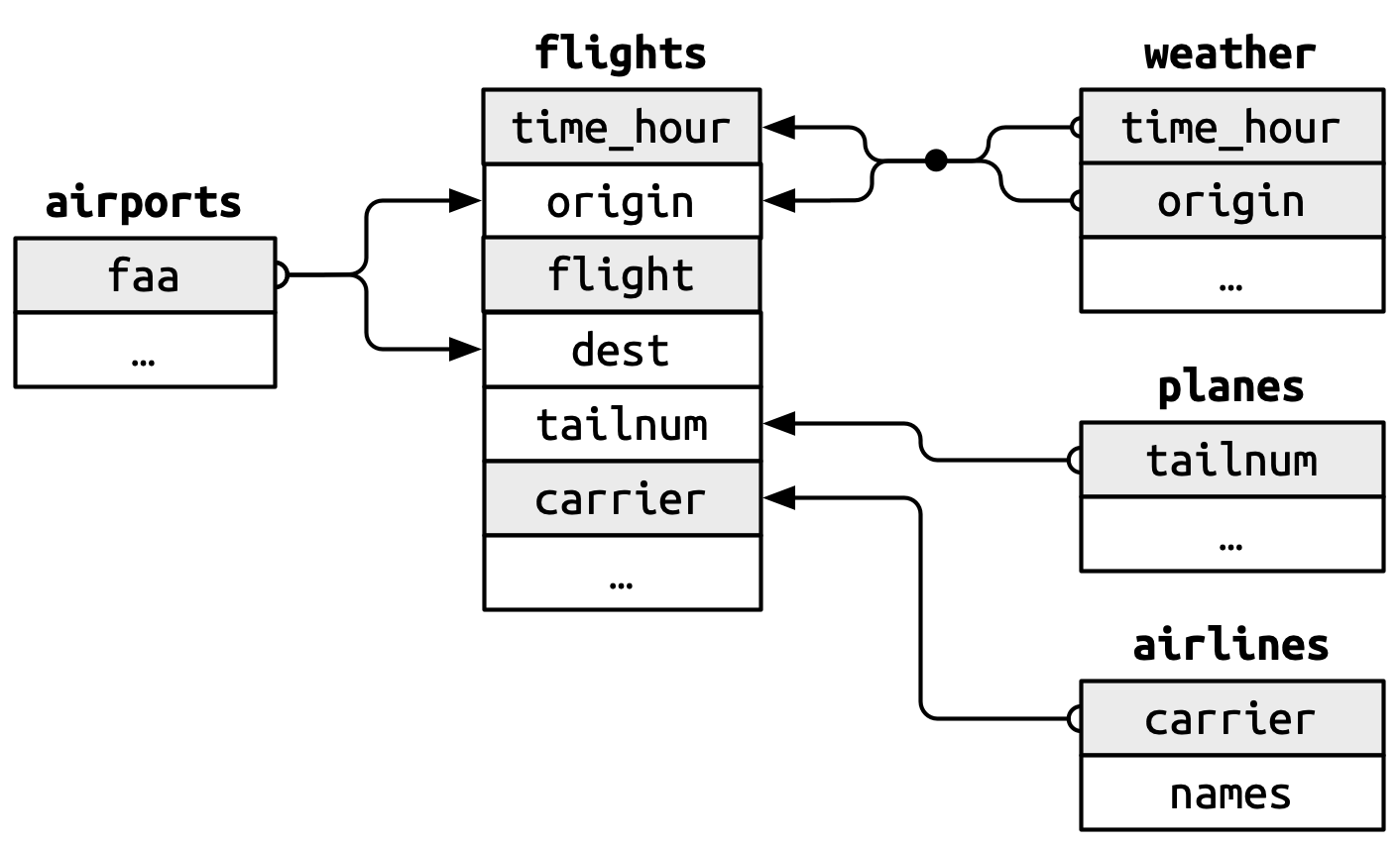
The relationships between the data frames are summarized in the figure below:
Questions
(7 points) Find the top 10 most popular destinations in the
flightsdata. How many flights went to each?(10 points) Create two new categorical variables in
flightsbased on the departure time (dep_time), and arrival time (arr_time). These new variables should have four categories: “early morning” for 12am to 6am, “morning” for 6am to 12pm, “afternoon” for 12pm to 6pm, and “evening” for 6pm to 12am. Show barplots of both of these new variables. What percentage of flights were “red eye” flights? We’ll define these as flights that depart in “afternoon” or “evening” and arrive in “early morning” or “morning.”(7 points) Were there any planes that flew for multiple airlines? If so, how many were there and which airlines did they fly for?
(7 points) In the figure above, there is a missing relationship between
weatherandairports. What is the relationship and how should it appear in the diagram?
For the rest of this assignment, the primary question you should keep in mind is this:
Which weather phenomena have the most impact on flight delays?
Don’t try to answer it now, but use this question to guide your exploratory data analysis.
- (7 points) In order to address our primary question, we want to prepare a tidy dataset (a single data frame). This will consist of information from the
flightsandweatherdata. Theyear,month,day,hour, andoriginvariables fromweatherprovide almost enough information to give each observation a unique value. Create a new variable in the weather dataset by pasting together those 5 variables, then determine how many duplicated values there are and explain why (Hint: compare your new variable to thetime_hourvariable).
Now merge the flights data and the weather data so that each flight contains information about the weather at its departure airport at the time it was scheduled to take off. You’ll want to use the variables time_hour and origin in order to do this.
(20 points) On this merged dataset, perform steps 2-5 of the EDA checklist presented in class. Remember the context provided by our primary question above.
(15 points) Calculate the average departure delay for each day (Hint: think about which variables you need in order to do this!). Which day had the worst average length of delay for departures? Now calculate the averages by day and origin. Which airport had the worst single day for delays and when was it? Now calculate the averages by hour and origin. Which airport had the worst single hour for delays (and when was it)?
(7 points) Compute the average arrival delay by destination, then add that information to the
airportsdata frame. Make a map showing the spatial distribution of delays (you can make it however you like, but we recommend using eitherggplotorleaflet). Use the color of the points to display the average delay for each airport.(20 points) Finally, create as many plots and summary statistics as needed to answer the primary question above.
This homework has been adapted from the exercises presented in Chapter 19 of R for Data Science (2e) by Wickham, Çentinkaya-Rundel, and Grolemund.