Lab 01 - Hello R!
Learning goals
- Get acquainted with R and RStudio, which we will be using throughout the course to analyze data.
- Appreciate the value of visualization in exploring the relationship between variables.
- Start using R for building plots and calculating summary statistics.
Terminology
We’ve already thrown around a few new terms, so let’s define them before we proceed.
- R: Name of the programming language we will be using throughout the course.
- RStudio: An integrated development environment for R. In other words, a convenient interface for writing and running R code.
I like to think of R as the engine of the car, and RStudio is the dashboard.
Starting slow
As the labs progress, you are encouraged to explore beyond what the labs dictate; a willingness to experiment will make you a much better programmer. Before we get to that stage, however, you need to build some basic fluency in R. Today we begin with the fundamental building blocks of R and RStudio: the interface, reading in data, and basic commands.
Getting started
1 Download R
If you don’t have R installed.
Go to the CRAN and download R, make sure you get the version that matches your operating system.
If you have R installed
If you have R installed run the following code
R.version
##                _
## platform       x86_64-apple-darwin20
## arch           x86_64
## os             darwin20
## system         x86_64, darwin20
## status
## major          4
## minor          3.3
## year           2024
## month          02
## day            29
## svn rev        86002
## language       R
## version.string R version 4.3.3 (2024-02-29)
## nickname       Angel Food Cake
This should tell you what version of R you are currently using. If your R version is lower then 4.3.0, I would strongly recommend updating. In general, it is a good idea to keep your R version up to date, unless you have a project right now that depends on a specific version of R.
1.2 Download RStudio
We recommend using RStudio as your IDE if you don’t already have it installed. You can go to the RStudio website to download and install the software. Once it is installed, open RStudio and use it to complete the rest of this lab.
Hello RStudio!
RStudio is comprised of four panes.
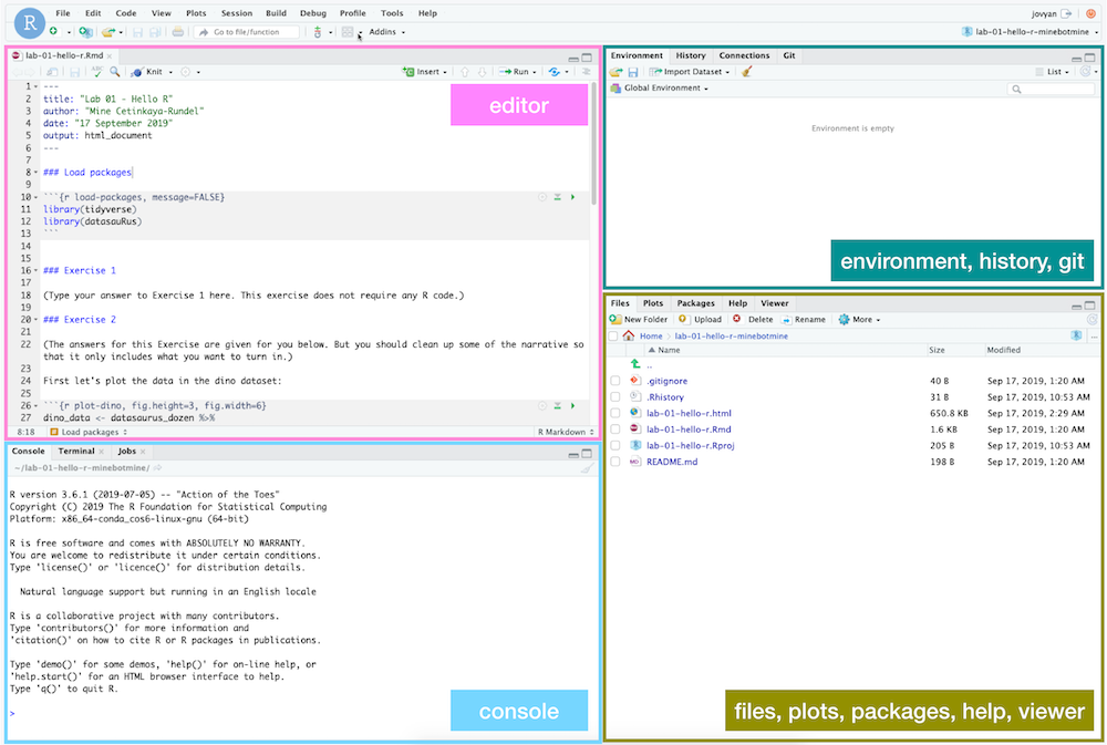
-
On the bottom left is the Console, this is where you can write code that will be evaluated. Try typing
2 + 2here and hit enter, what do you get? -
On the bottom right is the Files pane, as well as other panes that will come handy as we start our analysis.
-
If you click on a file, it will open in the editor, on the top left pane.
-
Finally, the top right pane shows your Environment. If you define a variable it would show up there. Try typing
x <- 2in the Console and hit enter, what do you get in the Environment pane?
Start a new Project
RStudio Projects are a great way to stay organized and keep all of your work on a particular topic in one place. Project files keep track of things like the R objects you are using and which files you have open, so that you can quickly jump in and out of different work environments.
We’re going to start a new Project called PM566labs. If you want to keep all of your materials for this class in one place, you may want to open Finder (MacOS) or File Explorer (Windows) and create a new folder (directory) for this class.
In the top right of the RStudio window, you should see a drop-down menu that says “Project: (None)”. Click on this and then “New Project…”, which will open up a dialogue box. If you had already created a PM566labs directory, you could choose the “Existing Directory” option to associate this Project with that directory. Since we haven’t done that, we’ll use the “New Directory” option, then select the generic Project type, “New Project”. Give your new directory the name PM566labs and use the “Browse” button to choose where you want to save it on your computer, then click “Create Project”. Now in the top right, you should see “PM566labs” next to the R Project logo.
Create a Quarto document
We will use Quarto documents a lot in this course because they are fully reproducible and allow us to seamlessly integrate code and text. We expect you to use Quarto for all homework assignments and (almost) all labs.
In the top left, you will see a “New File” icon (a white “plus” sign in a green circle over a blank document) that leads to a drop-down menu. Click on this and then select “Quarto document…”, which will open up a dialogue box. You can leave most of the settings on their defaults for now, just give your document a title (like “Lab 1”) and an author (yourself) and click “Create”. RStudio may ask you if you would like to install a package that is required, and if so, click “Install”.
This will open the default Quarto document, which already contains some example content. Read through it, then remove this content. Please do not hand in assignments that contain the default content, as I have seen it plenty of times! Set up new sections in your document titled “Question 1” through “Question 6”. This document will serve as the template for your responses to this lab. Under each section title, add an R code chunk via “Insert…”, “Executable Cell”, “R”. Alternatively, you can switch to the “Source” editor (in the top left of the Editor pane) and add an R chunk by typing the following:
```{r}
```
This will create an R code chunk and any code you add inside of it will be executed when you Render the document.
Save your Quarto markdown (qmd) file as lab-01.qmd and see what happens when you click “Render”.
Packages
R is an open-source language with a vibrant community of users and developers. Developers can contribute new functionality to R via packages. In this lab we will work with the datasauRus package, which contains a fun example dataset.
You can load this package with the following command:
library(datasauRus)
If you haven’t installed it yet and R complains, then you can install the package by running the following command (note that R package names are case-sensitive)"
install.packages("datasauRus")
We encourage you to work interactively on this lab (and future assignments) by running code directly in your Console pane. Try breaking down complex or unfamiliar lines of code into smaller, executable pieces to get a sense for how the code works. You may also want to open a new tab in the Editor windown that is just an R Script, where you can play around with pieces of code before adding them to the final product that is your Quarto document.
However, you should note that Quarto documents are Rendered in their own unique environment, separate from your interactive session. So while you should run library(datasauRus) in your Console, you will also need to include it inside an R code chunk if you want your Quarto document to use this package. Similarly, if you create a variable called var while running code in the Console, Quarto won’t have acess to it, so you will need to re-create that variable inside a code chunk.
Warm up
Before we introduce the data, let’s warm up with some simple exercises.
YAML
The top portion of your Quarto file (between the three dashed lines) is called YAML. It stands for “YAML Ain’t Markup Language”. It is a human-friendly data serialization standard for all programming languages. All you need to know is that this area is called the YAML (we will refer to it as such) and that it contains meta information about your document.
Open the Quarto (qmd) file in your project, make sure the author name is your name. You can add additional lines to the YAML section to control more aspects of your document. For example, you can set the output to be a PDF or HTML document by adding either format: pdf or format: html.
Regardless of what output format you choose, add another line to the YAML header that reads embed-resources: true. This tells Quarto that you want to produce a “stand-alone” document that contains all images directly in the document. If you don’t do this, Quarto will often create a separate directory (called <document>_files) that contains these images and your output will depend on this outside directory.
When you’re done, click “Render” to compile the document.
Data
The data frame we will be working with today is called datasaurus_dozen and it’s in the datasauRus package. Actually, this single data frame contains 13 datasets, designed to show us why data visualization is important and how summary statistics alone can be misleading. The different datasets are marked by the dataset variable. The data is contained in an object called a data.frame. Type datasaurus_dozen into the R Console and hit Return to see a printout of the dataset. Alternatively, you can use View(datasaurus_dozen) to open a new tab with the full dataset (but be careful! This command will not work in a Quarto document, because they are not interactive).
To find out more about the dataset, type the following in your Console: ?datasaurus_dozen. A question mark before the name of an object will always bring up its help file. Similar to View, this command must be run in the Console.
Question 1
- Based on the help file, how many rows and how many columns does the
datasaurus_dozenfile have? What are the variables included in the data frame? Add your responses to your lab report, with relevant code in the associated R code chunk, and free-form text outside of the code chunk.
Let’s take a look at what these datasets are. To start, we can make a frequency table of the dataset variable:
table(datasaurus_dozen$dataset)
Here, we used the $ operator to access a specific column (variable) of the dataset. Then we used the table function to summarize that variable. table is great for quickly summarizing categorical variables, but it’s not very useful for summarizing continuous variables, where most unique values are only present once. For continuous variables, try the summary function.
The original Datasaurus (dino) was created by Alberto Cairo in
this great blog post. The other Dozen were generated using simulated annealing and the process is described in the paper Same Stats, Different Graphs: Generating Datasets with Varied Appearance and Identical Statistics through Simulated Annealing by Justin Matejka and George Fitzmaurice. In the paper, the authors simulate a variety of datasets with the same summary statistics as the Datasaurus, but with very different distributions.
Data visualization and summary
Question 2
- Plot
yvs.xfor thedinodataset. Then, calculate the correlation coefficient betweenxandyfor just this dataset.
Below is the code you will need to complete this exercise. Basically, the answer is already given, but you need to include relevant bits in your Quarto document and successfully Render it and view the results.
We’re going to start by subsetting our data down to just the dino dataset.
Subsetting
dino_data <- datasaurus_dozen[datasaurus_dozen$dataset == 'dino', ]
There is a lot going on here, so let’s slow down and unpack it a bit.
The first thing to note is the assignment operator: <-. This special symbol is used to create a new object or assign a new value to an existing one. In this case, we’re creating a new object called dino_data.
The second important feature is the set of square brackets: []. When these come immediately after the name of an object, they are used for subsetting that object, or taking a smaller piece of it. In this case, we want to subset the datasaurus_dozen object. Since this is a two-dimensional data.frame, we can subset it by either rows or columns, or both. The comma (,) separates our row subset from our column subset. In this case, we only want to subset by row and keep all the columns, so there is nothing after the comma.
In R (as in Python and many other programming languages), we can check whether or not two values are equal by using the == operator. Here, we again use the $ to access the dataset variable and we check if it is equal to the value 'dino'. If it is, this comparison will return TRUE and we will keep that row. If it isn’t, this comparison will return FALSE and we will not keep that row.
Plotting
Next, we need to visualize these data. We will use the plot function for this, which is R’s most basic plotting function. If you provide the plot function with two numeric vectors, it will plot them in a scatter plot. Let’s see what happens when we plot the x and y variables from our dino_data object:
plot(dino_data$x, dino_data$y)
# ggplot(data = dino_data, mapping = aes(x = x, y = y)) +
#   geom_point()
(I’ve also included code for producing similar plots using the ggplot function from the ggplot2 package. This is another widely-used plotting function that includes some more aesthetically pleasing defaults, but requires more complicated syntax)
We will talk a lot more about the philosophy of data visualization, how to choose the right plot type, and constructing visualizations in layers in the coming weeks. But for now, you can follow along with the code that is provided.
For the second part of these exercises, we need to calculate a summary statistic: the correlation coefficient. The correlation coefficient, often referred to as \(r\) in statistics, measures the linear association between two variables. You will see that some of the pairs of variables we plot do not have a linear relationship between them. This is exactly why we want to visualize first: visualize to assess the form of the relationship, and calculate \(r\) only if relevant. In this case, calculating a correlation coefficient really doesn’t make sense since the relationship between x and y is definitely not linear – it’s dinosaurial!
But, for illustrative purposes, let’s calculate correlation coefficient between x and y. Like plot, the cor function takes two numeric variables and calculates their correlation coefficient:
cor(dino_data$x, dino_data$y)
# dino_data |>
#   summarize(r = cor(x, y))
(I’ve also included the “tidyverse” way of calculating this value. The “tidyverse” is a collection of packages that includes ggplot2 and is based on the concept of “tidy”, rectangular datasets. We will tend to focus on the “Base R” way of doing things, as learning the “tidyverse” coding style is almost like learning another language in addition to R)
Question 3
- Now try it on your own! Plot
yvs.xfor thestardataset, another one of thedatasaurus_dozen. You can (and should) re-use code we introduced above, just replace the dataset name with the desired dataset. Then, calculate the correlation coefficient betweenxandyfor this dataset. How does this value compare to therofdino?
Question 4
- Plot
yvs.xfor thecircledataset. You can (and should) reuse code we introduced above, just replace the dataset name with the desired dataset. Then, calculate the correlation coefficient betweenxandyfor this dataset. How does this value compare to therofdino?
Question 5
Now let’s plot all 13 datasets at once. In order to do this we will make use of the layout function. This function allows you to put multiple plots in the same plotting window. We will create a 4x4 matrix containing the values 1 through 16 and pass this to layout, which lets it know where we want each plot to go (we only have 13 datasets, so there will be a few empty spots at the end). This may be too many plots for a small viewing window, so if you get the error message Error in plot.new() : figure margins too large, try making your plotting window larger.
Then we use a for loop to perform a set of actions over every unique value of the dataset variable. This creates a new object, called name, that takes on each of those unique values, but it only exists within the context (interior) of the loop. Then we subset and plot the data, as we have before.
layout(matrix(1:16, nrow=4, ncol=4))
for(name in unique(datasaurus_dozen$dataset)){
  subset <- datasaurus_dozen[datasaurus_dozen$dataset == name, ]
  plot(subset$x, subset$y, main = name)
}
layout(1)
# ggplot(datasaurus_dozen, aes(x = x, y = y, color = dataset))+
#   geom_point()+
#   facet_wrap(~ dataset, ncol = 3) +
#   theme(legend.position = "none")
The second call to layout will reset the plotting window, so that the next plot will take up the entire window, rather than 1/16th of it.
Optional:If you really want to maximize the plotting area of this figure, you can also adjust the plotting margins via the par function (short for “graphical parameters”). The setting for margins is called mar and it takes a vector of length 4, specifying the bottom, left, top, and right margins, in order (the units are lines of text). You can set each margin to a value of 2 with par(mar = c(2,2,2,2)) and then reset to the default values with par(mar = c(5,4,4,2) + 0.1).
Question 6
Finally, we want to calculate the correlation between the x and y variables for all 13 datasets. Like before, we will use a loop, but this time, since we want to return a specific value every time through the loop, we will use the sapply function. sapply is useful way to apply a function to every element of a vector. In this case, we provide the vector of unique dataset names (like before) and then our own custom function. This function subsets the data as before, and then returns the correlation coefficient as the output of the function.
sapply(unique(datasaurus_dozen$dataset), function(name){
    subset <- datasaurus_dozen[datasaurus_dozen$dataset == name, ]
    return(cor(subset$x, subset$y))
})
# datasaurus_dozen |>
#   group_by(dataset) |>
#   summarize(r = cor(x, y))
You’re now done with the data analysis exercises, but we’d like you to do two more things:
Resize your figures:
Add the fields fig-width and fig-height to the YAML header of your document. These will allow you to specify the size (in inches) of any figures generated by the code chunks in your report.
You can also use different figure sizes for different figures. If you are in the Visual editor mode, switch to Source mode. Notice that each R chunk starts and ends with three backticks. Click on the gear icon in the top right of a code chunk and select “Use custom figure size” in the pop-up menu. Set the height and width of the figures and hit Apply when done. Then, render your document and see how you like the new sizes. Try making the plot for Question 5 larger, until you are happy with its size. Note that changing the figure sizes added new options to these chunks: fig.width and fig.height. You can change them by defining different values directly in your Quarto document as well.
Change the look of your report:
If you have time, you can explore the different ways you can add styling to your document. Try adding a theme field to the YAML header and see if you can find valid names of different themes.
Here is a Quarto cheatsheet and a general markdown cheatsheet that shows some of the many cool features you can make use of in a Quarto document.
Submitting your lab
Since we have not covered GitHub yet, for this week (and ONLY this week) you may email me a fully rendered PDF or HTML version of your completed lab at kelly(dot)street(at)usc(dot)edu.
This set of lab exersices have been adopted from Mine Çetinkaya-Rundel’s class Introduction to Data Science.